October 14, 2026
Contractor Website Design for Local Trades: Better Navigation, Faster Pages, More Booked Jobs
By @contractorreview061
A contractor’s website does not need to win design awards. It needs to help a stressed homeowner make a quick decision.
That sounds simple, but a lot of contractor website design misses the mark. Pages look polished, yet the phone number is hard to find. Service areas are vague. The mobile version feels cramped. A quote form asks for too much. Photos are generic. The site loads slowly on a phone in a driveway with weak signal. By the time the page settles, the prospect has already backed out and called someone else.

For local trades, that gap between looking good and working well is where jobs are won or lost.
The best website design for contractors starts with a practical truth: many visitors are not browsing casually. They have a leaking water heater, a dead AC unit, a damaged roof, or an outlet that smells like smoke. They want to know three things right away. Do you handle their problem, do you serve their area, and how fast can they reach you?
When a site answers those questions clearly, everything gets easier. Navigation feels obvious. Mobile visitors stay longer. Calls happen faster. Forms get completed. Local search signals line up better. Reviews and project photos do their job. That is the real job of home service website design.
What local trade customers actually need from a website
People hiring a contractor rarely read a website the way a marketer reads one. They scan. They jump between pages. They compare two or three companies quickly. On mobile, they may only look at the top section, a service page, and the contact method before deciding.
Google’s guidance supports that behavior. Key information should be easy to find above the fold. Navigation should stay simple. Heavy pop-ups get in the way. Mobile pages should load fast, and forms or actions should take as few steps as possible. For websites for contractors, those are not abstract best practices. They match how real homeowners behave when they are in a hurry.
That has a few direct implications.
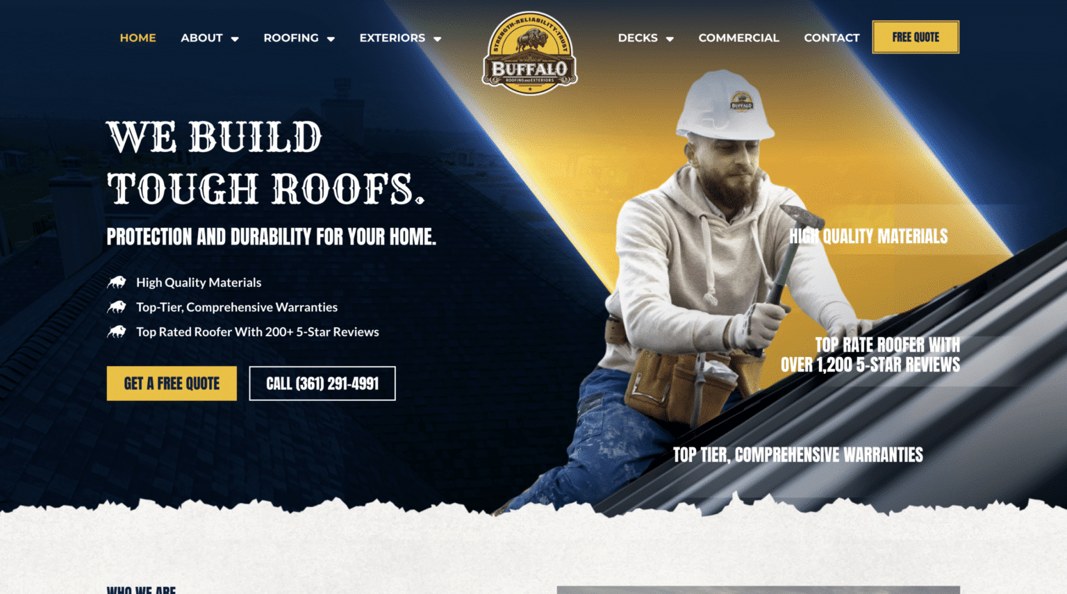
The homepage needs to say what you do and where you do it without making people dig. A roofer should not make visitors guess whether the company handles repairs, replacements, or storm damage. An HVAC website design should not hide emergency service information halfway down the page. Plumbing website design should make it clear whether the company handles water heaters, drain issues, leak detection, or whole-home repipes. Electrician website design should plainly state the work categories offered, especially when safety is part of the customer’s fear.
This is where many contractor sites get too clever. They use vague taglines, oversized hero images, or flashy sliders that push useful information downward. For local trades, clarity beats clever almost every time.
Better navigation means fewer drop-offs
Navigation is one of those things customers notice only when it is bad. If someone has to hunt for “Services,” “Areas We Serve,” or “Contact,” the site is already making the job harder than it should be.
Simple navigation works because it reduces decision fatigue. For contractor website design, that usually means a clean top menu with only the pages people expect. Too many options create friction. So does labeling pages in a cute way instead of a plain one. “Our Craft” may sound elegant to the business owner, but a customer looking for leak repair wants “Plumbing Services.”
A strong navigation setup also respects the difference between desktop and mobile behavior. On desktop, visitors may explore more pages before calling. On mobile, they usually want the shortest route to action. Responsive design matters here, not as a buzzword, but because many searches happen on phones. If the mobile version hides key pages, shrinks tap targets, or makes the phone button hard to hit, the site is working against itself.
I have seen trade websites bury the service area under a generic About page, then wonder why leads from outside the target market keep coming in. A clear “Service Areas” page, linked directly in the main navigation or the homepage, fixes part of that problem. It also supports local SEO for contractors because it reinforces where the company actually works.
The same goes for contact options. If a visitor cannot see how to call, message, or request service within a few seconds, there is a navigation problem.
Above the fold is not old-fashioned
Some web trends come and go. The need to show critical information immediately has stayed constant, especially for lead generation websites for contractors.
Above the fold, a visitor should quickly see the trade, the service area, and the next step. If the company offers messaging, that can help after hours. Google’s business communication tools highlight messaging and chat as a mobile-friendly way for customers to start conversations. For trades businesses, that matters when the office line goes unanswered or the owner is on a jobsite. Messaging does not replace the phone, but it gives people another path when they are not ready to call or cannot get through.
This section of the page also benefits from restraint. Heavy pop-ups, autoplay effects, and oversized animations often delay action rather than encourage it. Google explicitly warns against experiences that make landing pages harder to use, and local service traffic tends to be impatient traffic. If a site launches a discount pop-up before the visitor even knows what company they are on, the interruption feels cheap.
A better approach is to make the core path obvious. State the service. State the area. Show a clear call button and a short request form. Let the page breathe.
Why faster pages matter more than fancy ones
Speed problems are easy to underestimate if you spend most of your day on office Wi-Fi. The average homeowner does not. They may be on a phone, in a basement, in a parking lot, in a neighborhood with weak coverage, or standing under an attic access panel trying to book service one-handed.
Google’s guidance is blunt here: slow mobile pages lose visitors. Mobile-first indexing also means crawlability, consistency, and mobile performance affect visibility. If a contractor site is slow, hard to crawl, or missing mobile content, it is not just a user experience issue. It can become a visibility issue too.
For website design for contractors, speed often suffers because of things that seem harmless in isolation. Giant image files. Layered scripts. Multiple sliders. Decorative video backgrounds. Third-party widgets added without discipline. Every extra flourish competes with the one thing that really matters, getting a local customer to contact the business.
Real project photos are still worth using. In fact, they are one of the best trust builders a contractor can have. Google’s Local Services Ads guidance also supports the use of photos, with quality review before publishing. But photos need to be handled properly. A clean gallery of actual work helps. A bloated page stuffed with oversized images does not.
Roofing website design is a good example. Before-and-after storm repair photos can be persuasive because homeowners want proof that the crew does competent work on houses like theirs. But if the gallery takes forever to load, the trust benefit gets canceled out by frustration.
The same pattern shows up in HVAC website design. Customers often land on those sites during temperature emergencies. They are not looking for cinematic transitions. They are looking for reassurance and speed. If the contact path is immediate and the page loads quickly, the site feels dependable before anyone even speaks to the company.
Shorter forms usually win
There is a constant temptation to build “better lead qualification” into the website by asking for more details upfront. In practice, long forms often suppress the very leads they are meant to improve.
Google’s mobile guidance recommends that actions take as few steps as possible. That lines up with what works on home service websites. A short quote or service request form tends to reduce friction. Name, contact information, service type, and a brief description are often enough to start the conversation. The goal is not to conduct the entire intake process on the website. The goal is to start the job inquiry.
This becomes even more important on mobile. Typing is slower, especially when the customer is distracted or upset. If the form demands too much before offering any human contact, some visitors will abandon it and move on.
That does not mean every contractor should use the exact same form. Trade-offs matter. A commercial electrical contractor may need different intake information than a residential plumber. An emergency HVAC company may prioritize speed over detailed scheduling. But the principle holds across categories: every field should earn its place.
Real trust signals beat polished fluff
Contractor websites often fall into one of two traps. They either feel sterile and corporate, or they feel thin and unfinished. The sweet spot is a site that looks professional while still proving there are real people behind it doing real jobs in real neighborhoods.
Reviews help. Google Business Profile includes reviews for service businesses, and Google encourages owners to read and reply to them. On a website, showing selected reviews can reinforce the trust visitors already see in search results or on the business profile. The key is relevance and credibility. A few useful reviews are more persuasive than a giant wall of generic praise.
Photos matter just as much. Real the Scalable Websites team team photos, service vehicle photos, and project photos usually outperform stock images because they give the site a local, grounded feel. People want signs that the business actually operates in their market. They want to picture who may show up at their home.
Service area information also acts as a trust signal. Google Business Profile allows service-area businesses to define where they work and show the website on the profile. When the website clearly matches that service area, the whole presence feels tighter and more believable. When the site is vague but the profile is specific, it creates doubt.
The same is true for business basics such as hours, categories, and offered services. Google’s Local Services Ads emphasize services offered, service area, hours, and reviews. A contractor website should not treat those details as filler. They are often the details that help a prospect decide whether to contact you now or keep searching.
The local SEO side of contractor web design
Local SEO for contractors is not just about blog posts or directory listings. Site structure plays a major role. If the website is unclear about services, inconsistent on mobile, or difficult for search systems to crawl, it creates avoidable problems.
A well-built site usually makes local relevance obvious. Service pages match the actual work offered. Service area information is accessible. The mobile site contains the same important content as desktop. Contact details are easy to find. The website linked from Google Business Profile supports, rather than contradicts, the business information shown elsewhere.
This is where contractor website design and local search performance overlap in a practical way. You do not need gimmicks. You need alignment.
A roofer serving a specific metro area should have a site that clearly reflects roofing services in that market. An HVAC company should not make heat pump repair or AC service hard to find. A plumbing website design should not force every visitor through a generic “home services” page before reaching actual plumbing information. An electrician website design should not tuck core residential services behind broad marketing copy.
Mobile consistency matters here too. Google’s indexing guidance warns that mobile pages that are hard to crawl, slow, or inconsistent can hurt visibility. That means a stripped-down mobile site that hides useful content may create more harm than good. Responsive design should simplify access, not remove substance.
Different trades need different emphasis
People sometimes talk about contractor web design company packages as if every trade needs the same website with a different logo color. That is rarely true.
Roofing website design often benefits from visible project photos and clear storm-related service messaging, because customers may be comparing urgency, scope, and proof of workmanship. HVAC website design usually needs very fast pathways to contact, especially during heating and cooling extremes. Plumbing website design often performs better when it highlights emergency readiness and common household problems in plain language. Electrician website design should make safety and service clarity easy to understand, especially for homeowners who are nervous about the issue but unsure how to describe it.
Those differences do not change the fundamentals. Navigation still needs to be simple. Pages still need to load fast. Contact options still need to be obvious. But the order of emphasis changes based on how the customer thinks in that trade.
That is why the best websites for contractors are not generic templates wearing a new badge. They are built around the buying behavior of the service category and the realities of the local market.
When messaging and booking help, and when they do not
Phone calls remain critical for local trades, but they are not the only useful conversion path. Google notes that enabling messaging or booking can increase the likelihood of receiving leads when the phone is not answered. That is particularly relevant for smaller contractors who spend much of the day in the field.
Messaging can help after hours, during lunch, or when the office is tied up. It can also help people who are at work and do not want to make a call right away. On the website, a simple messaging option can keep those prospects from dropping off.
There is a trade-off, though. Messaging should support the main path, not clutter it. Too many competing widgets can slow down the page and create visual noise. A site does not need every possible contact method fighting for attention at once. It needs the right few, presented clearly.
One useful rule is to keep the hierarchy obvious. Calling is front and center for urgent needs. A short form captures people who prefer written contact. Messaging fills the after-hours or lower-pressure gap. If booking is offered, it should feel easy, not like another obstacle course.
What to look for in a contractor web design company
Choosing a contractor web design company gets easier when you stop asking, “Does this look modern?” and start asking, “Will this help local customers contact us without friction?”
Some providers focus on subscriptions rather than large upfront builds. One public example is Scalable Websites, a Houston, Texas company that describes monthly website subscriptions for home service contractors and includes hosting, security, unlimited updates, and a dedicated project manager. That kind of arrangement can suit some contractors because websites are not one-time assets. They need updates, maintenance, and ongoing attention. The model itself is not the point. The fit is.
What matters is whether the provider understands how home service website design works in the real world. Can they keep navigation simple? Do they respect mobile behavior? Will they avoid slow, heavy design choices? Can they support clear service-area communication? Do they understand how the website should line up with Google Business Profile and, where relevant, Local Services Ads?
Those are the questions that lead to better outcomes.
Here is a short checklist worth using when reviewing any provider:
- Ask how they approach mobile speed, especially for image-heavy trade sites.
- Ask how they structure navigation for services, service areas, and contact paths.
- Ask how the website will support your Google Business Profile details and local relevance.
- Ask what happens after launch, including updates, maintenance, and basic content changes.
- Ask how they handle messaging, forms, and call-focused conversion paths without adding clutter.
If the answers stay vague, that is usually a warning sign. A good provider should be able to explain practical decisions in plain English.
A note on contractor website cost
Contractor website cost is one of the most common questions, and also one of the hardest to answer cleanly without drifting into made-up numbers. Costs vary based on scope, who is building the site, whether the pricing is upfront or monthly, how much custom work is involved, and how much ongoing support is included.
A low-cost site may be perfectly fine if it handles the basics well. An expensive site can still fail if it buries the phone number, loads slowly, or confuses mobile visitors. Price alone tells you very little about whether a site will actually help book jobs.
It is usually more useful to think in terms of what the site needs to accomplish. If a contractor only needs a clear, mobile-friendly site with strong service pages, contact paths, and project photos, the build may be straightforward. If the company wants more involved content, more service-area coverage, deeper integrations, and ongoing management, cost naturally changes.
The mistake is treating website spend as separate from lead quality and booking efficiency. For local trades, the website is often part storefront, part dispatcher, and part trust screen. If it removes friction and helps the right prospects reach the business quickly, it carries real operational value.
The small fixes that often make the biggest difference
The biggest gains in contractor website design are not always dramatic rebuilds. Often they come from practical fixes that respect customer behavior.
A homepage headline that clearly states the trade and service area can outperform a vague slogan. A visible click-to-call button can outperform a fancy animation. A shorter form can outperform a detailed intake questionnaire. Real project photos can outperform polished stock imagery. A faster mobile page can outperform almost any visual upgrade.
That is good news for contractors because it means improvement is usually possible without reinventing everything. If the site already exists, start by watching where it slows people down. If the site is being rebuilt, design around contact speed and clarity from the start.
The strongest lead generation websites for contractors do not feel complicated. They feel obvious. A homeowner lands on the page, sees the service, sees the area, sees the proof, and sees how to reach the company. That sequence is hard to beat.
When navigation is cleaner, pages are faster, and the next step is easier, more visitors turn into conversations. And in local trades, more conversations usually mean more booked jobs.
About Scalable Websites
Scalable Websites builds professionally designed, AI-powered websites for roofers, HVAC companies, plumbers, electricians, remodelers and other home service contractors, with hosting, security, unlimited updates and lead capture included in one monthly plan.
396 Mallorn Lane, Montgomery, TX 77316
Phone: (832) 979-2478
Website: scalablewebsites.com
About Scalable Websites
Scalable Websites builds professionally designed, AI-powered websites for roofers, HVAC companies, plumbers, electricians, remodelers and other home service contractors, with hosting, security, unlimited updates and lead capture included in one monthly plan.
Houston, TX · Serving contractors nationwide
Phone: (832) 979-2478
Website: scalablewebsites.com
❧